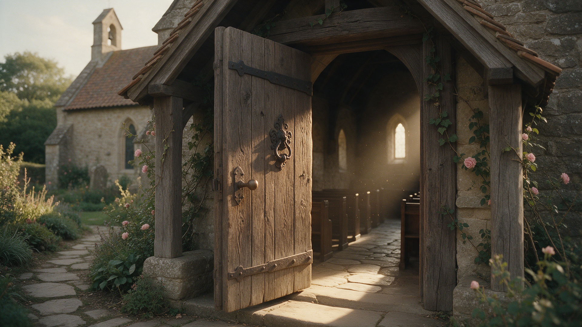
Nobody walks into your church building for the first time without checking your website first. That's not a guess, it's just how people find churches now. Which means your website isn't a nice-to-have brochure, it's your first service, your first handshake, your first impression, and it happens before anyone ever finds a parking spot.
Here are nine signs it's quietly costing you.
- It hasn't changed since your last building campaign. If your last redesign lined up with a building project from five or more years ago, your site is out here telling first-time visitors about a church that doesn't exist anymore.
- Service times are hard to find. If someone has to click more than once to find out when and where to show up, you've already lost them. This is the single most important piece of information on the entire site, full stop.
- It's not built for phones. Most people are finding you on a phone, standing in a parking lot or scrolling the couch Saturday night. If your site is hard to read or navigate on mobile, that's most of your traffic having a bad time before they've even met you.
- There's no obvious next step. A visitor lands on your homepage. What do you actually want them to do? If the answer isn't obvious in five seconds, they'll bounce without doing anything, and you'll never even know they were there.
- The design looks like a template from a decade ago. Stock photos of hands raised in worship. A font nobody's used since 2015. None of that is technically wrong, it just signals "we haven't touched this in a long time," and people notice.
- Giving feels like an afterthought. A hidden giving link is a missed opportunity and a friction point for people who already showed up ready to support your church.
- It loads slowly. People wait about three seconds before they bounce. If your church website takes longer than that, you're losing visitors before they've read a single word you wrote.
- Your staff dreads updating it. If swapping a sermon series graphic or an event date means calling a developer, your website has quietly become a liability instead of a tool.
- It doesn't sound like you. Generic church copy that could belong to any congregation in America doesn't help anyone decide your church is the one for them.
What To Do About It
You don't need a full rebuild to fix most of these. Sometimes it's a redesign. Sometimes it's better content and clearer navigation on the bones you already have. What you need is an honest look at your site through a first-time visitor's eyes, not a staff member's, because nobody on staff has landed cold on your homepage since 2019.
We'll give you that honest look for free, gaps included.
Start Your Build and see what a focused week of design could do for your church's first impression.